BEFORE THE DETAILS
- Approve an identified material and a representative sample before repeating the design.
- Evaluate detail, contrast and depth separately.
- Link the approved sample to the artwork version, engraving position and fixture arrangement.
1. Decide what the sample must demonstrate
Describe how the item will be used, rather than giving only a material name. Include dimensions, the visible face, logo position and whether people will hold it or read it from a distance. Request a sample from the product or sheet specified for the order, recording the supplier and finish when available. Wood with a different colour or treatment can help explore the idea, but cannot by itself approve another batch’s final appearance. Decide which variations are acceptable before comparing samples. For example, acceptance can require both languages to remain readable without magnification and the logo to stay within the agreed area. State any natural variation the project allows rather than leaving judgment to “the same as the picture.”
Material safety comes before any trial. Epilog’s guidance stresses identifying a material’s composition and consulting its safety data sheet when uncertain. Do not send an unidentified item for a trial merely because it resembles a familiar material. The operator reviews the actual product and coatings against the machine and manufacturer’s guidance, then decides whether testing is appropriate. A visually successful small sample does not establish material suitability, and a customer’s appearance approval does not replace the safety review.
2. Test the artwork at its actual size
Prepare clean logo artwork at the intended size, with a readable reference showing the Arabic and English wording. Check dots, hamzas and enclosed letter spaces; zooming into a phone image is no substitute for reviewing small lettering at actual size. Epilog explains that increasing engraving resolution cannot repair poor-quality artwork. Have the original logo source reviewed instead of converting a small screenshot directly into production artwork, and approve any proposed identity change separately from the engraving settings.
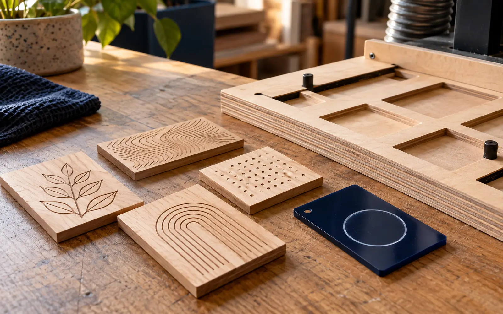
Include the hardest parts of the design in the sample: the smallest line, finest feature, solid area and closely spaced details. If the order includes different names, use a long name and a short one to check the layout. A photograph needs its own review of brightness, contrast and detail; a successful simple logo does not validate it. Keep a readable copy of the wording before converting it into the required production format, so spelling errors can be found without reconstructing the artwork.
3. Separate contrast, depth and detail quality
Contrast describes how clearly the engraving stands out from its background; depth concerns how far it sits below the surface. Do not choose a sample solely because it looks darker in a photograph. Review it under suitable lighting and from the normal reading angle. You may prefer a clear engraving with little tactile relief to a deeper result with less readable lettering. Record a separate judgment for each property, and specify whether the goal is visual appearance alone or a texture both parties must assess on the physical item.
Trotec describes a test-matrix approach for comparing engraving tones and saving the selected result. For your order, numbered samples with understandable differences are sufficient, while the operator records each trial’s conditions in the production record. Do not transfer internet settings to a different material or machine. The final round should include the actual design after the agreed cleaning and finishing, because selecting a test square alone does not establish the legibility of the complete logo.
| Review area | What should you check? |
|---|---|
| Contrast | Readability against the background in the intended lighting. |
| Depth and texture | The required feel on the physical sample. |
| Detail | Clear dots, enclosed spaces and fine lines. |
4. Review positioning and repetition before the batch
An attractive engraving can still be unsuitable if it sits too close to an edge or looks tilted on the product. Choose a clear measurement reference, such as the face centre or an agreed edge, rather than saying “roughly in the middle.” For repeated items, Trotec describes jigs that locate multiple pieces in defined positions. The operator reviews the fixture design and its fit to the item; one fixture should not be assumed suitable for every product.
Review face orientation and name order before repetition, particularly when items look alike. Match each fixture position to the correct record, and inspect an example after exchanging one item for another to check that loading instructions are clear. This is workflow planning, not an operating procedure: machine setup, workholding and protective measures belong with a qualified operator following the manufacturer’s manual. Keep a photograph of the approved sample with its reading direction and artwork version identified.
5. An Oman example and a practical approval checklist
Suppose a gift shop in Nizwa wants wooden boxes personalized with a bilingual logo and recipients’ names. This is a hypothetical example, not a documented Color City project. The shop provides a box of the intended type, chooses the longest name to check available space, and compares two logo samples at final size. After appearance approval, another box is reviewed for positioning and data order. Any change to the box type, coating or artwork is recorded and reviewed before relying on the previous approval.
Sample approval does not automatically approve the name list: every variable text needs a separate check. Keep a record matching each name to its item number and approval status, and identify the authorized approver so reviewers’ comments do not conflict.
- Material, product and finish identified and reviewed.
- Wording, size, face and engraving position approved.
- Reference sample numbered and linked to the artwork version.
- Acceptable variation and the change-review step agreed.
Common questions
Should I choose the deepest engraving for the best result?
Not necessarily. Review readability, contrast and texture for the intended use, and approve a physical sample. Required depth is a separate decision from legibility.
Is a sample photograph enough for approval?
A photograph helps check wording and position, but cannot convey texture or contrast under every light. If these matter, inspect the item itself and specify what your approval covers.
What should I send to discuss an engraving test with Color City?
Send the artwork, a product photograph and material identification, dimensions, quantity and engraving location. Test feasibility, material suitability and personalization scope are reviewed for each order before agreement.
Sources and further reading
YOUR NEXT STEP
Turn the details into a clear brief.
Send a product photograph, logo artwork, material, dimensions and quantity, and specify what you want the sample to test.